How to Use Claude Design to Turn One Prompt into a Product Prototype
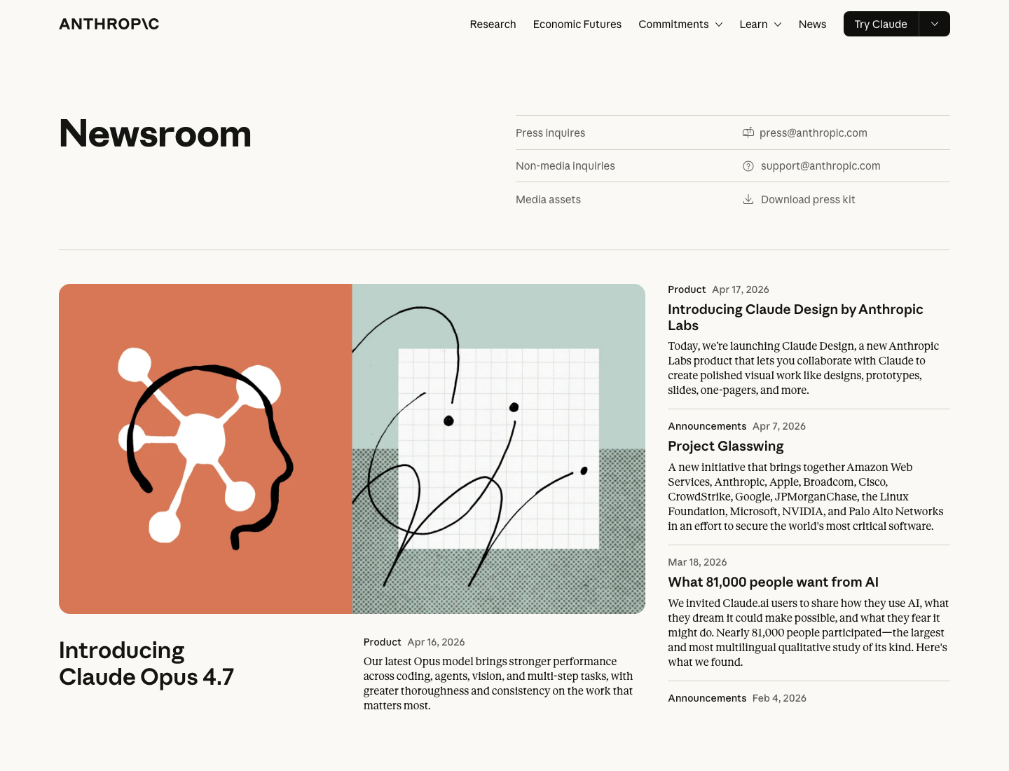
Claude Design launched on April 17, 2026 as a new Anthropic Labs product for prototypes, slides, one-pagers, and visual drafts. This guide focuses on what it is actually good at, how to prompt it, and how to turn the first draft into something your team can discuss.
How to Use Claude Design to Turn One Prompt into a Product Prototype
If Claude Design suddenly started showing up all over your feed, the short version is this:
Claude Design is a new Anthropic Labs product launched on April 17, 2026 that lets you create visual work like prototypes, slides, one-pagers, and design drafts by talking to Claude.
That matters because it sits in a useful middle ground. It is not a traditional design tool, and it is not just an image model that spits out a pretty screen. The point is to describe an idea, get a first draft quickly, keep refining it in conversation, and then export it into a real team workflow.
Source: Anthropic News
Start with 4 real public screenshots
You were right to push on this. A case section should use real public visuals, not invented summary cards. These four are actual public Claude Design images from Anthropic or media coverage.
1. Official Anthropic screenshot: live controls for theme, breakpoints, and visual tuning

This is the most useful official image because it shows how Claude Design is meant to be used. It is not just one-shot generation. It is generation plus iterative control over theme, breakpoint, and presentation details.
Source: Anthropic announcement
2. Public screenshot from TechCrunch: the product’s main presentation view
![]()
This is useful for understanding the product surface itself. For a first-time reader, it communicates the product shape faster than another paragraph of explanation.
Source: TechCrunch
3. Public screenshot from TechCrunch: prompt-to-visual workflow framing

This image helps explain the product category. Claude Design is not really about final polish first. It is about getting from a request to something discussable much faster.
Source: TechCrunch
4. Public screenshot from TechCrunch: interface and output shown together

This is the cleaner way to understand the bigger move: Anthropic is clearly trying to own more of the path from idea to prototype to implementation handoff.
Source: TechCrunch
What Claude Design actually is
According to Anthropic, Claude Design can help create:
- designs
- prototypes
- slides
- one-pagers
- other visual work that needs a fast first draft
The real value is not “another AI design tool.” The value is that it compresses several steps into one flow:
- explain the idea
- generate a first version
- refine layout, copy, and visual direction
- export it for collaboration
That makes it especially useful for founders, product managers, marketers, and operators who can describe what they want but do not want to start from a blank canvas in a traditional design tool.
Who it is best for
Claude Design is strongest for two groups:
- people with product ideas but limited design-tool fluency
- designers who want to explore many directions quickly before committing
It fits especially well when you need to:
- mock up a new product screen
- draft a landing page direction
- turn an idea into a one-pager
- build a quick internal slide deck
It is much less suited to pixel-perfect production work, complex motion design, or final delivery files that need deep manual control.
The best first workflow to try
Do not start with “design my entire app.”
The better first move is to pick one focused scenario and make Claude Design solve that well. For example:

Design a mobile meditation app prototype. The home screen should feel calm and premium, with a daily practice module, a breathing exercise entry point, a sleep audio section, and a members area. Use soft natural colors and a clean wellness-brand layout.
Why this works:
- the product type is clear
- the screen scope is narrow
- the modules are specified
- the visual direction is concrete
Claude Design does not fail because prompts are short. It usually fails because prompts are broad and vague.
A more reliable prompt formula
If you want the first draft to be closer to something your team can actually discuss, use this structure:
You are a product designer. Create a prototype for a [product type].
The target user is [who this is for].
This screen should help the user [main job of the screen].
Include these modules: [list 3 to 6 modules].
The visual style should feel [style target].
Do not use [things to avoid].
For example:
Create a homepage prototype for a travel budget app.
The target user is a young traveler planning a first international trip.
The screen should help them see total budget, flights and hotels, daily spending, remaining budget, and the next best action.
Include a top welcome area, budget summary card, category spending chart, alert section, and a clear CTA.
Keep it clean, trustworthy, and Apple-like. Avoid playful illustrations and gamified UI.
That is usually much more stable than something like “make me a beautiful travel app.”
The interesting part is not the first draft
One of the more important points in Anthropic’s launch is that Claude Design is meant for continued refinement, not just one-shot generation.
That means the better workflow is:
- generate a first version
- refine structure and hierarchy
- tune brand feel and visual tone
- export it into a collaborative tool
Your second round might look like this:
Keep the overall structure, but make the homepage more restrained. Reduce card density, enlarge the daily practice area, and make the CTA feel more premium and less template-like.
Your third round might look like this:
Keep the layout, but shift the palette from green to muted blue-gray, make the typography feel more elegant, and tone down the sales feel of the members section.
That “shape first, polish second” pattern is usually more reliable than trying to over-specify everything in the first message.
Why the Canva connection matters
Claude Design would be much less useful if it only produced drafts that stayed trapped inside a demo environment.
The Canva integration changes that. Anthropic and Canva both describe a workflow where Claude Design gets you to the first version quickly, and Canva turns that into something editable and collaborative.

Based on the public announcements, Claude Design supports these next steps:
- export to
PPTX - export to
PDF - export to
HTML - send designs to Canva for editing
That is important because many AI design tools can generate a draft, but they do not fit cleanly into how teams actually work.
Why it is suddenly everywhere
Claude Design is getting attention because it solves a real bottleneck:
a lot of people can describe a product idea clearly, but they cannot turn it into a presentable visual draft quickly.
That gap is exactly what this product is targeting.
The important part in the public Anthropic and Canva announcements is not just another export format. It is that the workflow is finally clearer:
- Claude Design gets you to a first visual draft quickly
- Canva handles editing, brand polish, and collaboration
- Claude Code takes an approved direction into a real codebase
Anthropic is also positioning it beyond designers alone. The launch is clearly aimed at teams that need to move from idea to prototype faster, even when they do not have full design capacity available for every exploration.
When to hand off to Claude Code
If you already work with Claude Code, the split is fairly natural:
- use Claude Design to explore layout, structure, and direction
- use Claude Code to turn the approved direction into real product code
That is the cleaner workflow:
- Claude Design for visual exploration
- Claude Code for implementation inside the codebase
The 4 mistakes people will make first
1. Asking it to design the whole product at once
Start with one screen, one flow, or one prototype. That is where the tool is easiest to judge.
2. Writing only style words and no job to be done
“Minimal, premium, futuristic” is not enough. The screen still needs a clear purpose.
3. Throwing away the first draft instead of iterating on it
In many cases, it is better to keep the structure and refine hierarchy, tone, and density.
4. Treating it as the final delivery tool
Claude Design is strongest as a first-draft and exploration tool, not necessarily the final destination for every design asset.
A short getting-started checklist
- pick one narrow screen or prototype first
- define the product type, user, screen goal, and modules
- ask for structure before asking for polish
- use follow-up prompts to tune tone and brand feel
- hand the result off to Canva or engineering when it is ready