What Is GPT Image 2? A Practical Guide to OpenAI's Viral Image Workflows
A practical walkthrough of what people mean by GPT Image 2, what it is actually good at, and how to use prompt patterns that produce useful image outputs.
What Is GPT Image 2? A Practical Guide to OpenAI's Viral Image Workflows
A practical walkthrough of what people mean by GPT Image 2, what it is actually good at, and how to use prompt patterns that produce useful image outputs.
First, clear up the name
If you keep seeing GPT Image 2 across X and AI circles, the most useful way to read that phrase is this:
It refers to the noticeably stronger generation and editing behavior people are seeing from OpenAI's latest image stack, especially around text rendering, structured layouts, infographic-style outputs, and iterative edits.
As of April 18, 2026, the phrase itself is still more of a community label than a clean official public model name.
Based on OpenAI's public materials:
- On March 25, 2025, OpenAI introduced 4o Image Generation in ChatGPT.
- On April 23, 2025, OpenAI launched
gpt-image-1in the API. - On December 16, 2025, OpenAI released the new ChatGPT Images experience and made
gpt-image-1.5available in the API.
So when people say "GPT Image 2 is going viral," they are usually talking about the newest OpenAI image capability as experienced in the wild, not necessarily a publicly documented API model literally named gpt-image-2.
The important part is not memorizing a name. It is keeping these three things separate:
- the latest Images experience inside ChatGPT
- the API model
gpt-image-1.5 - the rumor-heavy community shorthand "GPT Image 2"
Once you keep that straight, the rest of the discussion becomes much easier to follow.
This collage works as a compact snapshot of the GPT-image2 wave as it spread across X.
Seven sourced examples worth looking at first
Most model launches get attention for a few days and then fade.
This wave kept spreading because people were not just seeing prettier images.
They were seeing outputs that looked like finished artifacts with text, structure, and layout.
The seven examples below all have traceable source posts. Where the original post exposed a prompt or at least a clear task description, that is included as well.
1. Realistic scenic calendar
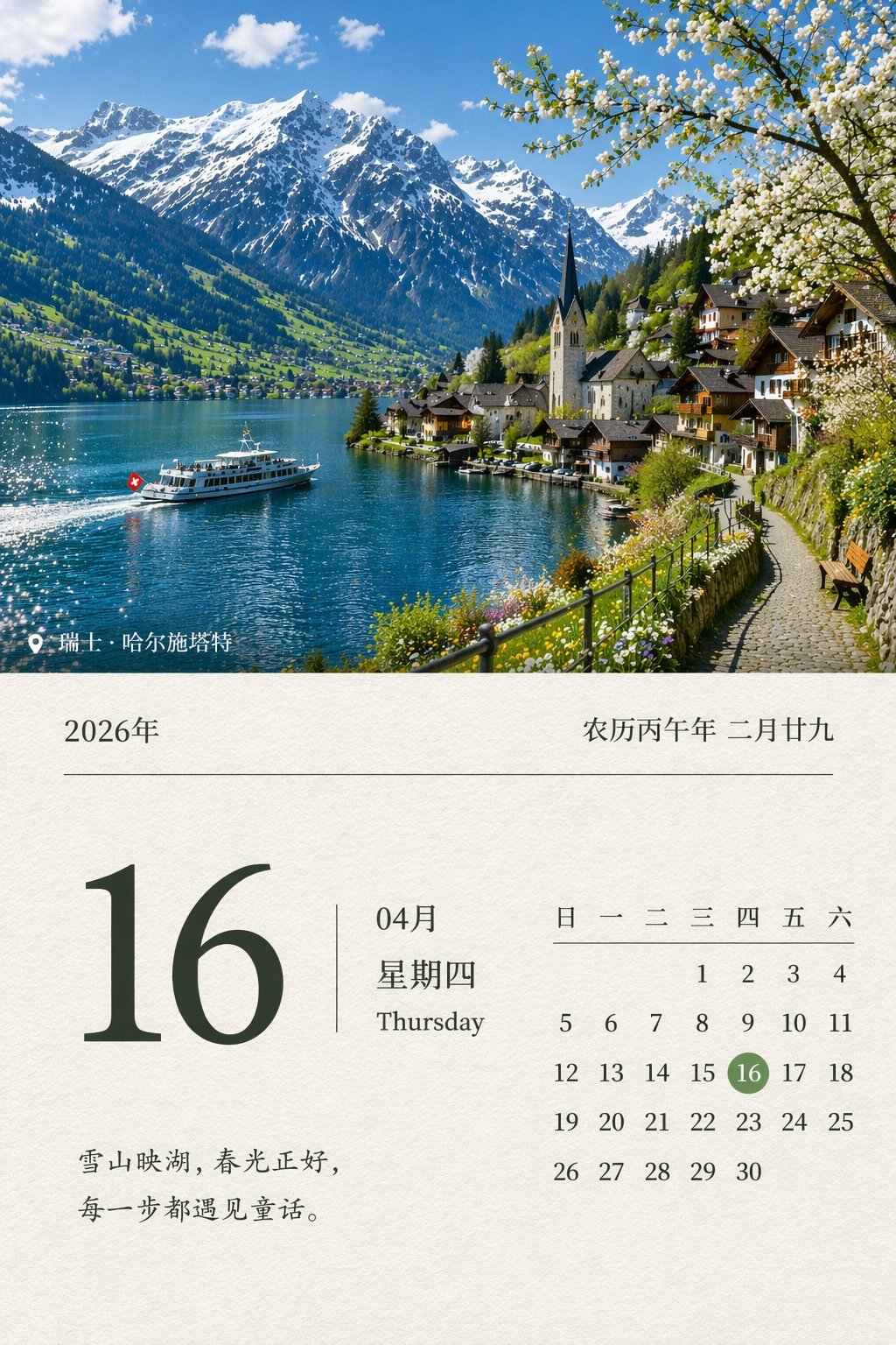
This kind of image travels fast because it tests several things at once: date accuracy, layout, realistic photography, and Chinese text rendering.
Source post: WY (@akokoi1)
Prompt shared in the original post:
Design a realistic scenic calendar for April 16, 2026.
A more robust version to try:
Design a realistic scenic calendar poster for April 16, 2026. Use a high-quality landscape photograph as the main visual. Make the date information clear and readable. The overall composition should feel like a real premium calendar cover, with accurate Chinese typography, a calm and natural mood, and no gibberish text.
2. Turn a GitHub project into a promo poster
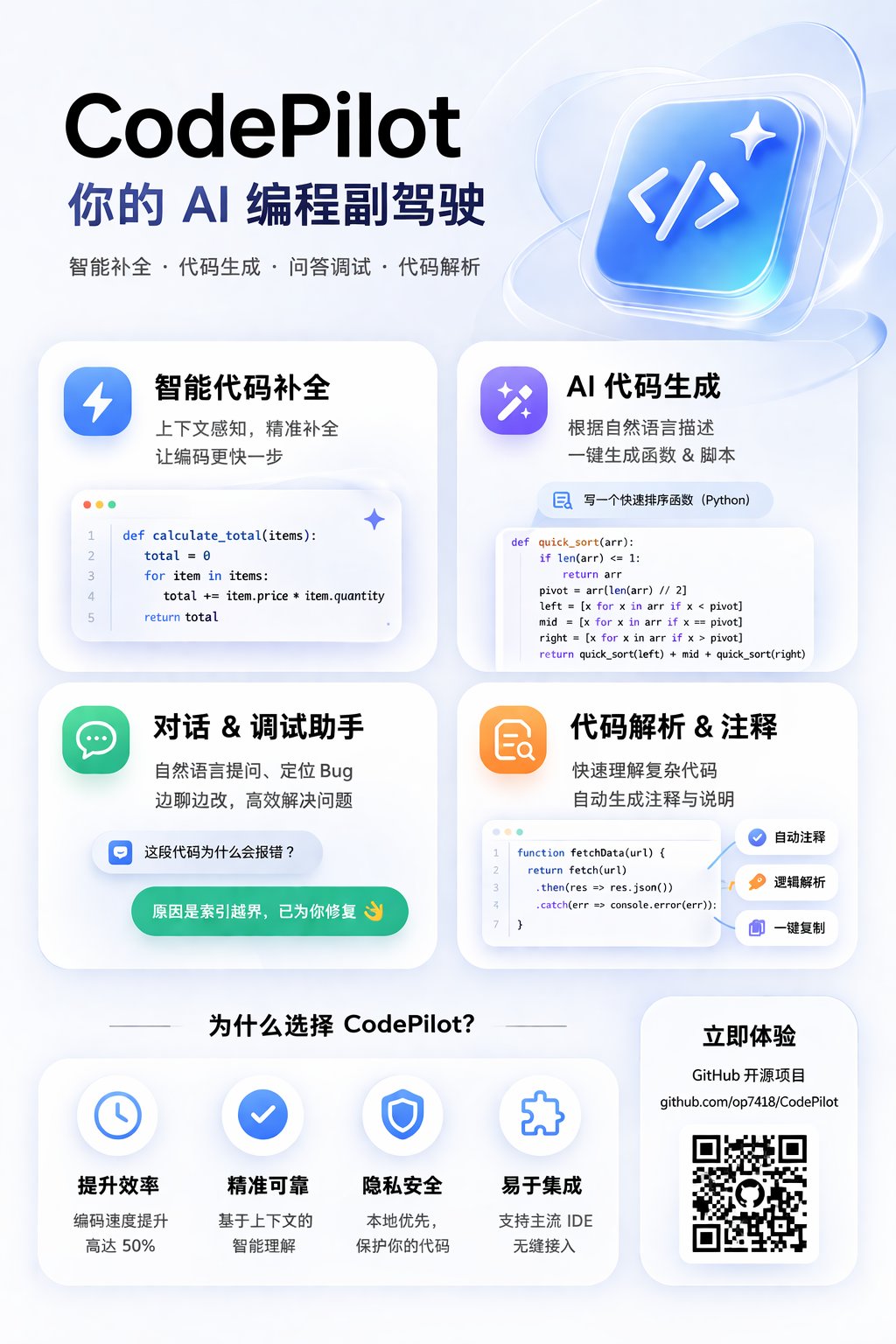
This is one of the clearest commercial use cases because it is not just "draw something nice." It is taking real product information and reorganizing it into marketing creative.
Source post: 歸藏(guizang.ai) (@op7418)
What the original post confirms: the author gave the model a GitHub link and asked for a card-style internet promo poster, and the generated information was largely correct.
A reusable prompt pattern:
Using the real information from this GitHub project, create a card-style internet promo poster.

Requirements:
- 4:5 vertical layout
- strong headline at the top
- 4 feature cards summarizing the core capabilities
- project link and QR-code area near the bottom
- accurate Chinese copy
- polished SaaS-style marketing visual
- clean, modern, tech-forward color palette
3. VTuber-style logo generation
![]()
This is not only about whether the model can place text. It is about whether it can produce decorative lettering, brand personality, and a coherent aesthetic direction at the same time.
Source post: みどり🐲Midori Tatsuta (@midori_tatsuta)
What the original post confirms: the author explicitly described these as GPT-image2-generated VTuber-style logos.
A reusable prompt:
Design a set of anime-style logos for fictional VTuber characters.

Requirements:
- Japanese idol / VTuber visual language
- clear and readable Japanese title lettering in each logo
- multiple styles: dreamy, dark fantasy, fresh, magical book, street-electro
- clean line work
- high commercial finish
- pure white background, presented like a branding pitch board
4. Turn one concept into a full MV storyboard
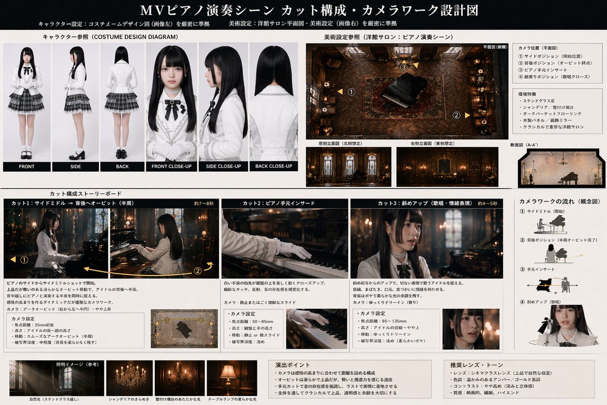
This example shows the structural side of GPT Image 2 especially well. It is not just drawing a character. It is organizing a character sheet, environment reference, shot list, and camera logic into one readable layout.
Source post: WTR (@wtry1102)
What the original post confirms: the author used ChatGPT to design a Seedance2 MV prompt, then gave GPT Image 2 the character sheet and background so it could output a diagram-like storyboard board.
A reusable prompt:
Using this character sheet and background reference, generate a music-video storyboard and camera-design board.

Requirements:
- top section shows character references and a scene overview
- middle section breaks the sequence into 3 to 4 key shots
- each shot includes camera angle, shot size, action, and emotion
- right side includes camera movement diagrams
- overall presentation should look like a professional production storyboard
- keep all text as clear and readable as possible
5. Dense educational diagrams
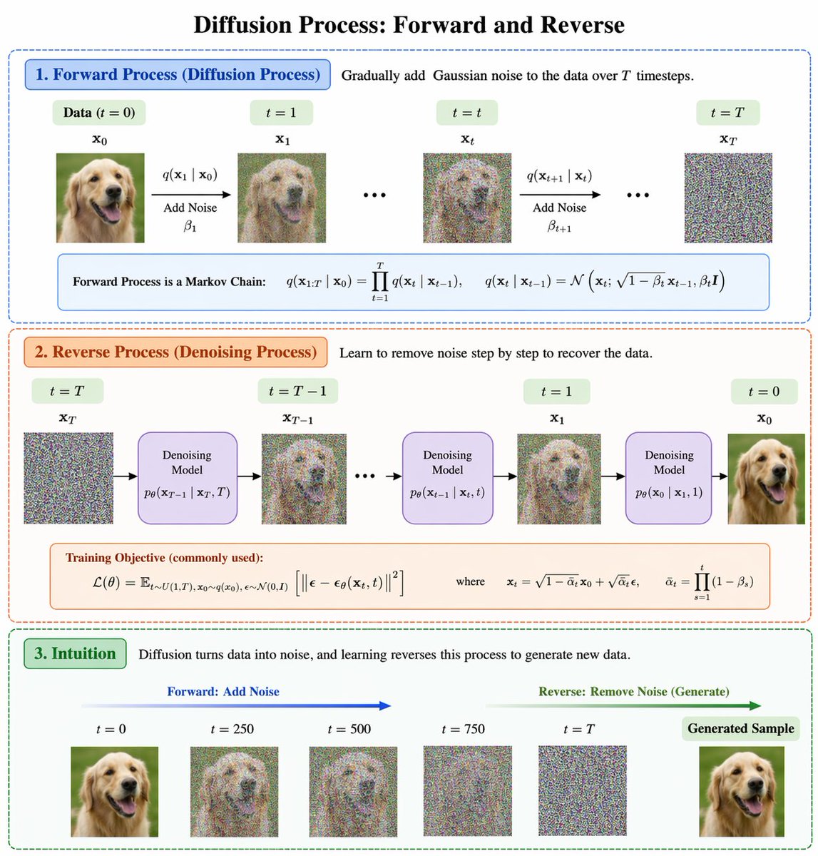
This class of image used to fail constantly because it requires structure, labeling, arrows, hierarchy, and a believable academic visual style at the same time.
Source post: BubbleBrain (@BubbleBrain)
The original post did not expose a full prompt. It only made a broad claim: GPT-Image-2 is a huge leap.
A practical prompt to recreate the pattern:
Design a clear academic-style diagram titled "Diffusion Process: Forward and Reverse".

Requirements:
- a single main title at the top
- two large sections: Forward Process and Reverse Process
- arrows connecting each step
- short formulas and concise explanatory labels
- visual style should resemble a high-quality machine learning lecture graphic
- clear typography, disciplined structure, restrained color palette
6. Realistic Chinese exam paper
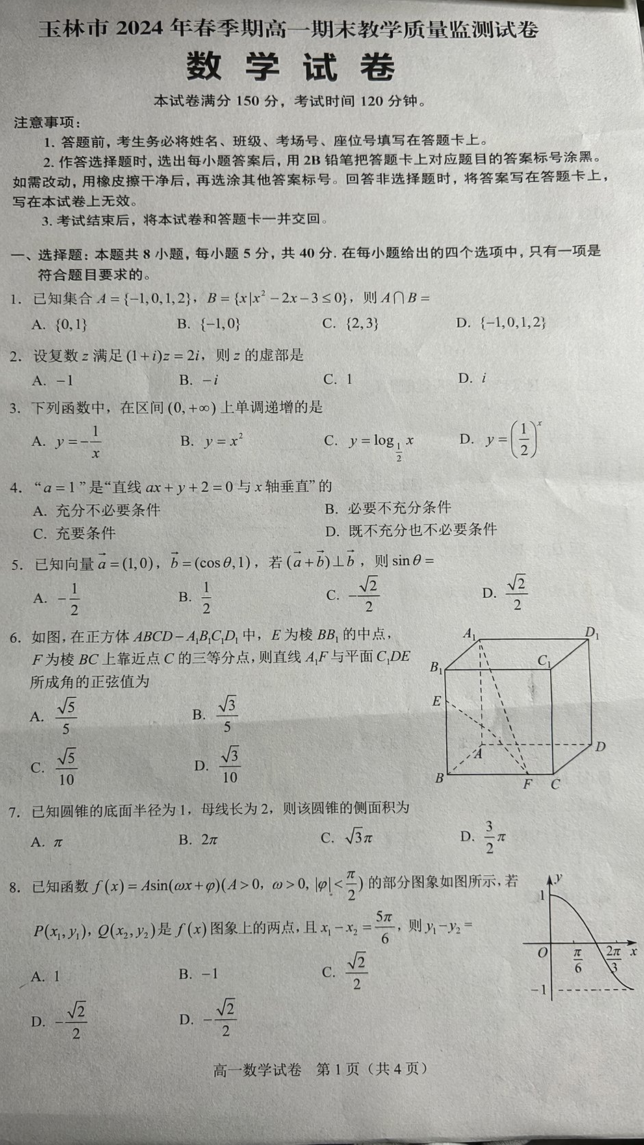
This is one of the most direct demonstrations of the text upgrade because an exam sheet leaves very little room for impressionistic guessing.
Source post: 秋风_irwin (@qiufenghyf)
What the original post confirms: the author highlighted not only the realism of the sheet, but also that the questions themselves looked plausibly real.
A reusable prompt:
Generate a realistic high-school math exam paper photo.

Requirements:
- simplified Chinese
- looks like a real paper casually photographed with a phone
- title, total score, and exam duration at the top
- multiple-choice and geometry questions in the body
- slight perspective distortion and natural shadows on the paper
- question text and options should look realistic, clear, and readable
7. Long-form Chinese scripture layout
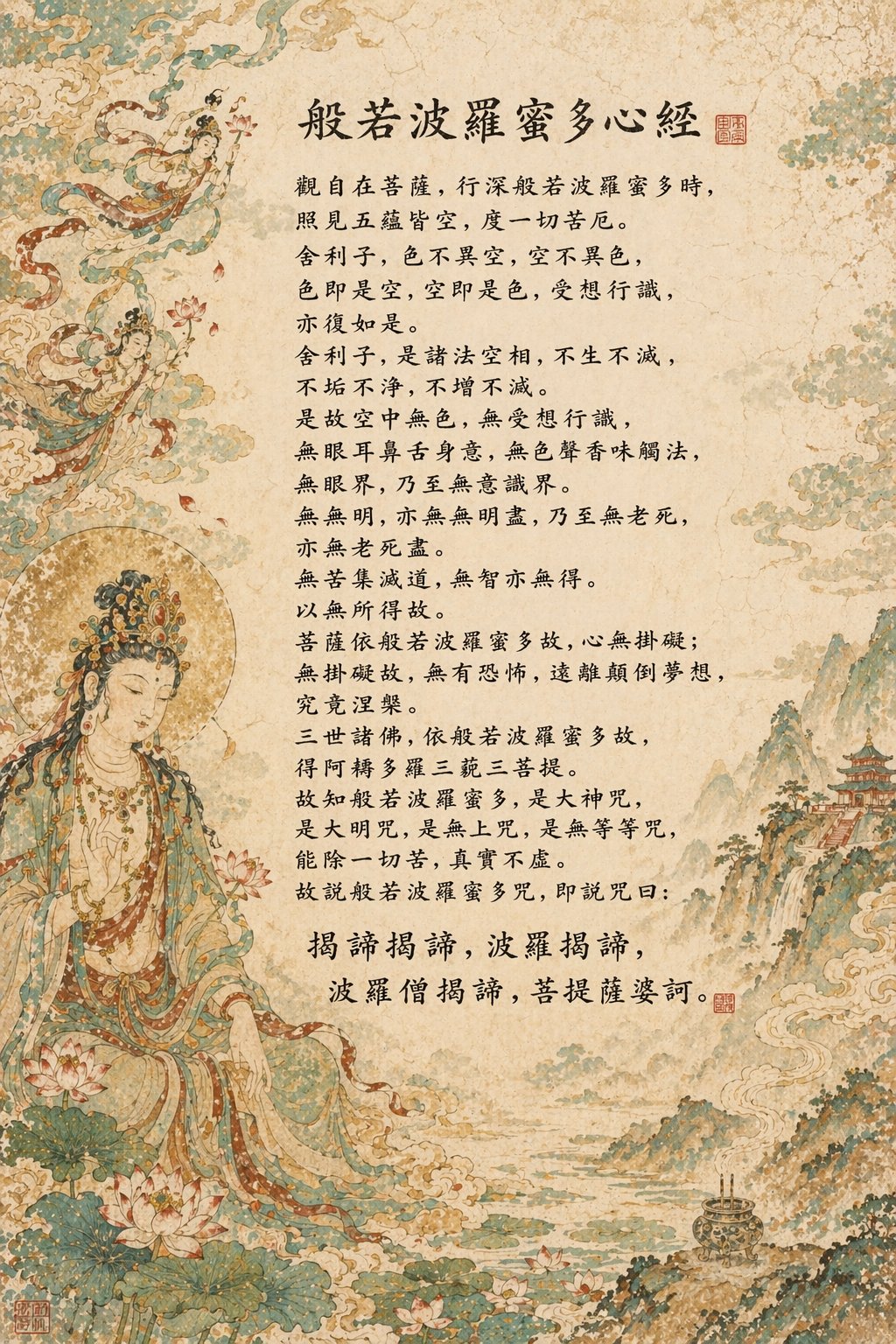
This kind of output used to be a nightmare for image models because it combines lots of characters, dense layout, and consistency across a long block of text.
Source post: sundyme (@sundyme)
What the original post confirms: the author explicitly said the prompt did not spell out the entire Heart Sutra line by line, and that the model handled much of the text generation on its own.
A prompt pattern worth testing:
Create a vertical poster in a classical East Asian Buddhist manuscript style.

Requirements:
- a large block of vertically arranged Chinese scripture text in the center
- a title at the top
- delicate Buddhist figure painting and ornamental motifs around the borders
- aged paper and classical pigment texture
- orderly, dense typography with as little gibberish as possible
Why it is getting so much attention
The excitement is mostly coming from four areas.
1. Text rendering is much more usable
Older image models often collapsed when asked to place lots of text inside an image.
This generation is getting attention because posters, labels, UI text, and infographic headings are often far more legible than before. That is the difference between a fun demo and a genuinely useful creative tool.
2. Prompt following is stronger
It is not just about "make a poster."
It is about whether the model can handle:
- 4:5 layout
- title at the top
- three blocks in the middle
- CTA at the bottom
- off-white background
- modern editorial style
OpenAI's own materials emphasize stronger instruction following and more precise editing. That makes the model much more useful for real design tasks.
3. Structure and world knowledge feel better
A lot of viral examples involve:
- maps
- timelines
- diagrams
- dashboards
- mock screenshots
The improvement is not that every factual detail becomes perfect. The improvement is that the model increasingly behaves like a visual assistant that understands what kind of structured artifact you are asking for.
4. Iterative editing is far more practical
This is easy to miss, but it matters.
The real value is often not pure generation from scratch. It is the ability to start with an image and then iteratively revise:
- background
- text
- styling
- lighting
- composition details
That is much closer to an actual workflow.
What GPT Image is especially good at
If you want practical use cases, start here.
1. Posters and covers with text
Great for:
- social media covers
- article headers
- event posters
- marketing creatives
2. Infographics and roadmaps
This is one of the clearest breakout use cases because it combines layout, hierarchy, icons, labels, and short copy.
3. E-commerce and brand assets
OpenAI's API materials explicitly point to design, editing, marketing collateral, and product content. That makes the model useful for merchants, SaaS teams, and creators.
4. UI mockups and fake screenshots
One viral class of examples is realistic UI output:
- app home screens
- dashboards
- fictional social profiles
- believable mobile screenshots
5. Editing existing images
For many teams this is the highest-value use case:
- keep the subject
- change the setting
- preserve likeness
- update text
- refine only part of the image
A prompt structure that actually works
The best prompt is usually not the longest one. It is the clearest one.
Use this six-part pattern:
- Goal
- Subject
- Layout
- Style
- Text content
- Constraints
Template:
Create a [asset type] about [topic].

Main subject: [what should appear].
Layout: [where title, labels, body, CTA should go].
Style: [editorial / cinematic / product ad / infographic / minimal].
Color palette: [specific colors].
Text in image:
"..."
"..."
"..."

Requirements:
- all text must be legible
- clean typography
- strong visual hierarchy
- no gibberish text
- no watermark
- high detail
This works because you are specifying both the content and the arrangement.
How to turn these examples into your own prompts
After looking at the sourced examples above, a pattern becomes obvious:
The strongest prompts usually define the output as a finished artifact, not just as "an image."
The most common artifact types in this wave are:
- calendars, posters, and promo graphics
- logos, title lettering, and branding boards
- storyboard sheets, diagrams, and roadmaps
- test papers, screenshots, and realistic interface mockups
In practice, that means starting with what the final deliverable is, then describing what needs to appear inside it.
A reusable skeleton looks like this:
Create a [artifact type].

Topic:
[what the image is about]

Visual content:
[the objects, sections, structure, or references that must appear]

Layout requirements:
[where the title goes, how many blocks, whether arrows, cards, sidebars, or QR areas are needed]

Text requirements:
[the text that must appear in the image]

Style requirements:
[realistic / anime / SaaS marketing / academic infographic / classical East Asian / etc.]

Constraints:
- all text should be as legible as possible
- no gibberish
- realistic layout logic
- high detail
If the first attempt is close, do not throw it away too quickly.
A better follow-up is often:
Keep the overall composition unchanged. Only improve the typography, fix incorrect text, and make the layout more polished.
Three workflow tips that matter more than "magic prompts"
1. Start short, then iterate
Do not begin with a giant essay prompt.
Start with:
- subject
- layout
- style
- essential text
Then refine.
2. Isolate the text you want rendered
If you need text inside the image to behave well, list it explicitly:
Text in image:
"Headline"
"Subheadline"
"Button"
3. Use preservation language during edits
This one matters a lot:
Keep the composition and subject unchanged. Only update the headline and color palette.
Without that, the model may unnecessarily rebuild the whole image.
Do not overstate it
It is strong, but not magical.
Common failure modes still include:
- long text blocks
- dense tables
- small labels in many regions
- factual errors in knowledge-heavy diagrams
The most reliable workflow is still:
generate the structure, refine locally, fix the text, then polish.
Final takeaway
GPT Image 2 is not exciting only because it draws better images.
It is exciting because it increasingly behaves like a visual collaborator that can follow instructions, place text, preserve structure, and revise outputs across iterations.
That is what moves image generation from novelty toward workflow.
Sources
- OpenAI: Introducing 4o Image Generation
- OpenAI: Introducing our latest image generation model in the API
- OpenAI Docs: Image generation guide
- OpenAI Docs: GPT Image 1.5
- OpenAI: The new ChatGPT Images is here
- OpenAI Help: ChatGPT Images FAQ